This is my name logo, i connected the R and the W also every other letter is a different font, it has no background, could be many different colors.
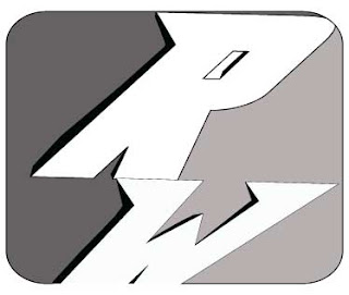
 This is my initials logo, I connected the R and the W again, but all of the black lines were put in by me to make it look like its 3d, the 2 sides could be any colors dark on the left and lighter on the right.
This is my symbols logo, i made the name to look like a bunch of balloons, i made the triangles under the letters to look like where the air goes in and of course the strings hanging down, i then made the name 3d, it could be many colors.


I really like your last two logos. I think that you should try to make the strings thinner so that they are more proportional. Over all very good though!
ReplyDeleteThere logos are all really nice! I like the second one the most. The only thing i would change would be maybe on the last one making just the letters 3-D and not the arrows. Other than that these are good!
ReplyDeletei really like all these. my favorite is the second one. he only thing i would change is in the third one don't make the string 3D. other then that there really good!
ReplyDeleteYour logos are really cool. I especially love the 2nd one and how it looks almost like a superhero logo. I agree with watermELLEN in how the strings should look proportional to the letters. Other then that, very good!
ReplyDeleteCool Logos. I like the second one. You should move the W in the first one over so it is under the right side of the R. Over all very good though!
ReplyDeleteyour logos are very creative, nice job. i think the R should be centered over the W a little bit more.
ReplyDeleteI like your name logo because you created it with the pen tool. You can tell how creative you are just by looking at this logo. The one thing is that I can't tell what the symbol logo is supposed to be. Maybe you could just clean that up to make it noticeable what the symbol is.
ReplyDelete