My Blog
Welcome to my blog!!!!!!!!!
Friday, November 12, 2010
Fruit logos
i Found some nice logos all involving fruit. I picked this one out because of the interesting font and the construction of the kiwi. The bird doesn't seem like to much, but the kiwi would take a while to do, making all the seeds that are different and constructing the different layers so that the piece of fruit looks like it is open. http://www.designioustimes.com/design/fruity-designs-showcase-of cool-fruit-logos.html
Brown Logos
I found a blog containing all logos with brown in them. I liked this logo that says sail on rain on it, it is cool because the designer must have made simple shapes like my space shuttle then added colors and shadows to it. I like the shadows that go along the lines of the umbrella as well as the handle that goes into being a light. Take a look at all of the other logos. http://naldzgraphics.net/inspirations/40-cool-and-unique-brown-logos-for-inspiration/
More Bird logos
After looking at the sparrow logo, i looked around and i found this blog that only has bird logos. IF you can see this nice hummingbird logo, they drew all of the shapes and then used the transparency to make everything fit together. It almost looks like a very complicated puzzle. Take a look at some other great bird logos at this site. http://www.1stwebdesigner.com/inspiration/bird-logos/
Wednesday, November 10, 2010
Clever Logos
I found another blog with some clever logo like this lg one. If you look it goes from the regular logo and finally ends up as pacman at the end. On this blog there are around 20 logos from well known companies like of course lg, fedex, and amazon. http://www.toxel.com/design/2010/06/09/24-cool-logos-with-hidden-symbols/
50 good logos
I found this blog on fuelyourcreativity.com, it has 50 logos that use a lot of simple tools in illustrator. My favorite logo is one towards the bottom of the page for a company called sparrow. It is the head of a bird that is pretty cartoon look in some ways but the picture finishes with the neck feathers just stopping at one point and i think it looks pretty cool. http://www.fuelyourcreativity.com/50-kick-ass-logos-for-inspiration/
Scrap Sheet 2
In this project i used part 2 of the vectordiary.com tutorial on using adobe illustrator. I learned how to add colors, borders, make borders, combine and subtract shapes, and to make transparencies. I used the pathfinder tool, and pen tool the most. I made a banana, an ancient key, the letter r, and some borders with stars. I think the coolest one to do was the circle transparencies.
I did i much better job on this scrapsheet then i did on the other one. I think that the only downside to this one is the banana which just looks like a half moon. I think that these skills will help later when we do logos of our own. 9/10
I did i much better job on this scrapsheet then i did on the other one. I think that the only downside to this one is the banana which just looks like a half moon. I think that these skills will help later when we do logos of our own. 9/10
The Great Pumpkin

I did good on this but i wish i could have made it look a little more real, right now its just a circle with lines in it, i should have used the pen tool. 8/10
Monday, November 8, 2010
Spaceship
In this project i made a spaceship. I used the Spaceship tutorial on http://www.denisdesigns.com/blog/2009/03/create-a-simple-spaceship-in-illustrator/, i used the shape tools, i used the pen tools, i also used the pathfinder tool multiple times, and made shadows using the opacity. and finally added color to all of the objects.
I did a good job on the whole spaceship with a couple of shadows. The background also looks good with the stars that are half shown under the spaceship. The moon needs a lot of work, it is crooked and not thick enough.
8/10
I did a good job on the whole spaceship with a couple of shadows. The background also looks good with the stars that are half shown under the spaceship. The moon needs a lot of work, it is crooked and not thick enough.
8/10
Scrap Sheet

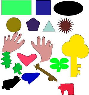
I think i did a pretty good job, all of my shapes are good, with different colors in each one. The key, the shamrock and heart are the best things that i made myself, but everything else is not very good as anyone could see. I did learn how to use all of the tools a lot better, and i have color in all of the shapes including finger nail out lines in my hands. 4/10
Subscribe to:
Posts (Atom)


